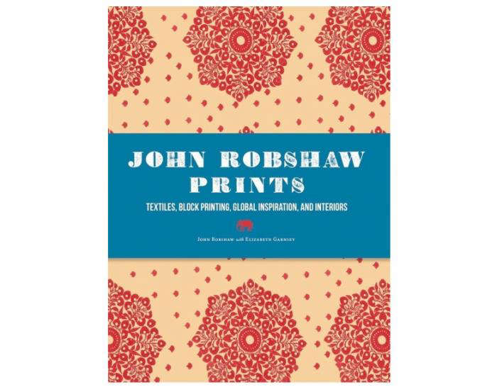

If your home has ever looked around and whispered, “I could use a little more soul,” there is a decent chance John Robshaw prints have already crossed your mind. Or your Pinterest board. Or that one shopping tab you swore you closed three weeks ago. Robshaw’s textiles live in a sweet spot that many brands chase and few actually catch: artisanal but approachable, colorful but not cartoonish, relaxed but still pulled together. In other words, they look like they belong to someone interesting.
At their best, John Robshaw prints do not feel manufactured in the cold, clinical sense of the word. They feel collected. They feel traveled. They feel like the visual diary of someone who notices old markets, hand-carved details, faded palaces, garden walls, and the exact blue of a sky that only seems to appear after a long flight and a stronger-than-expected cup of tea. That is part of their appeal. These prints are decorative, yes, but they are also deeply tied to process, place, and personality.
Who Is John Robshaw, and Why Do His Prints Matter?
John Robshaw is a textile designer whose work has become closely associated with layered interiors, block-print traditions, and a sort of worldly ease that says, “Yes, I like pattern, and no, I am not afraid of it.” His creative path began in fine arts, and that background still shows in the way his prints often feel painterly rather than merely repetitive. Even when a pattern is geometric or floral, there is usually a looseness to it. It does not feel trapped inside a grid. It breathes.
That sense of movement is a big reason the brand stands out. Plenty of home brands sell prints. Plenty sell blue prints, floral prints, global-inspired prints, and “artisan” prints in fonts that practically beg for side-eye. But John Robshaw prints have long been admired because they fuse old techniques with a personal artistic point of view. They are not trying to look perfect. They are trying to look alive. That distinction matters more than ever in a market full of polished, overly digital sameness.
What Makes John Robshaw Prints Distinctive?
1. A Handcrafted Point of View
The first thing many people notice about John Robshaw prints is that they do not look machine-neat. That is a compliment. These patterns often carry the visual charm of handwork: slight irregularity, tonal depth, and edges that feel human rather than robotic. In a world where so many fabrics look as if they were generated by a very competent spreadsheet, that handmade quality is refreshing. It gives bedding, pillows, and textiles a softness that reads as luxurious without becoming precious.
This handcrafted sensibility is especially important in block printing, where repetition is never sterile. A hand-applied print has rhythm, but it also has small surprises. One motif may stamp a little darker than another. One section may look ever so slightly softer. Instead of ruining the design, those nuances create character. They are the fabric equivalent of a lived-in leather chair or a ceramic mug that is not perfectly round and is all the better for it.
2. Global Inspiration Without Feeling Like a Costume
One of the reasons John Robshaw prints remain so popular is that they pull from textile traditions, travel, and historical references without feeling themed to death. The designs often nod to Indian block printing, Mughal gardens, floral repeats, paisleys, medallions, and regional craft traditions, yet they are reworked through a modern decorating lens. The result is not “world traveler starter pack.” It is more subtle than that. It is informed, layered, and edited.
That editing matters. Robshaw’s prints are often rich in story, but they are usually presented in a way that works beautifully in American homes. A duvet might feature a traditional-style floral, but the palette keeps it airy. A pillow might carry a bold pattern, but the scale makes it easier to pair with stripes, solids, or smaller motifs. The look is eclectic, yet it rarely feels chaotic unless you deliberately decide chaos is your aesthetic, in which case, carry on bravely.
3. Color That Knows How to Behave
John Robshaw prints are known for color, but not in a blunt, shouty way. Even brighter combinations tend to have a washed, layered, or earthy quality that makes them easier to live with. Blues are especially important in the brand’s visual language, from indigo-inspired tones to softer sky shades and watery neutrals. You also see saffron, blush, sage, ochre, lavender, peacock, and other colors that sound like they belong either in a design showroom or on a very ambitious cocktail menu.
The beauty of these palettes is that they help the prints feel expressive without becoming exhausting. A room can include multiple John Robshaw pieces and still feel restful. That is not magic; it is color discipline. The brand tends to work in families of tones that can layer together. Even when the pattern mix gets adventurous, there is often an underlying calm in the palette that keeps the whole room from looking like it lost a bet.
How John Robshaw Prints Are Made
To understand the appeal of John Robshaw prints, it helps to understand the process behind them. Block printing is central to the brand story. Traditionally, the method involves hand-carved wooden blocks that are dipped in dye or pigment and pressed onto fabric. The block itself is a work of art, carved carefully so that every stamp carries the pattern with clarity and texture. It is an old technique, and that age is part of its beauty. It connects decoration to craftsmanship in a direct, visible way.
For Robshaw’s work, the process is deeply tied to collaboration with skilled artisans. Designs are translated into carved blocks, then printed by hand, often with attention to layering, alignment, and color depth. This is not a one-click miracle. It is labor. It is training. It is repetition with nuance. The print may look breezy in a finished bedroom, but getting there involves practiced hands, material knowledge, and the sort of patience modern life usually reserves for buffering icons and sourdough starters.
That is also why slight variation is part of the charm. When you buy into this style, you are buying something that carries evidence of making. The print is not supposed to feel soullessly identical from edge to edge. It is supposed to carry a handcrafted spirit. For shoppers who are tired of decor that feels generic, this can be the difference between “nice enough” and “where did you get that?”
Where John Robshaw Prints Show Up Best
Bedding
If there is one category where John Robshaw prints truly shine, it is bedding. The brand’s duvets, shams, quilts, and sheets often use pattern in a way that makes the bed feel layered, inviting, and visually rich without becoming overworked. Small-scale florals can add texture to sheets, while larger or more graphic patterns create focal points on duvets and coverlets. The look is often crisp yet relaxed, which is exactly what you want from a bed unless your goal is to recreate a furniture showroom no one is allowed to touch.
Many of the brand’s bedding pieces are especially appealing because they balance beauty with comfort. Organic cotton percale, breathable weaves, soft hand-feel, and easy layering make these prints practical as well as decorative. That matters. Even the most gorgeous duvet loses points if it feels like sleeping inside a decorative envelope. Robshaw’s bedding tends to win fans because it offers both tactile comfort and that collected, editorial look people want in a bedroom.
Pillows
Pillows are arguably the easiest entry point into John Robshaw prints. They let you sample the brand’s world without committing your entire room to a full textile opera. Block-printed pillows, embroidered pillows, and hand-painted styles can shift a sofa, chair, or bed from ordinary to layered in seconds. They also make pattern mixing much less intimidating. You can introduce a floral, a stripe, and a geometric print one pillow at a time, like a responsible adult easing into maximalism.
The variety of sizes helps too. Decorative squares, bolsters, and elongated formats let you build combinations that look intentional rather than random. A larger-scale pillow can anchor a seating area, while a smaller print adds detail and softness. Because John Robshaw prints often share a broad visual language, mixing pieces from the brand tends to feel easier than trying to combine patterns from several unrelated sources that have never met and frankly do not trust one another.
Bath, Kids, and Beyond
Although bedding and pillows get most of the spotlight, John Robshaw prints extend beyond the bedroom. Bath textiles, tabletop pieces, nursery items, and collaborations have helped bring the look into more corners of the home. That expansion makes sense because the design language is flexible. A print that feels serene on a quilt can feel lively on a crib sheet or sophisticated on a towel. The common denominator is a handcrafted, pattern-forward style that is meant to be lived with, not just admired from a safe distance.
How to Decorate with John Robshaw Prints Without Creating Visual Chaos
Start with Scale
One of the smartest ways to use John Robshaw prints is to vary the scale. Mix a larger pattern with a smaller one so the room feels balanced. If everything is big and loud, the eye gets tired. If everything is tiny and busy, the room can feel fussy. A good combination might be a larger print on the duvet, a smaller repeated motif on the sheets, and a medium-scale accent pillow to bridge the gap. Think of it as a conversation, not a shouting contest.
Choose a Tight Color Story
Pattern mixing becomes much easier when the colors know each other. Stick to three or four tones that can move across the room: blue and white with a touch of green, for example, or blush, sand, and ochre. John Robshaw prints are particularly good at this because many designs already feel related. When the palette is disciplined, you can be more adventurous with motifs. The room still feels cohesive, even if the prints are doing a lively little dance.
Use Solids and Texture as Breathing Room
Not every inch needs a print. In fact, the printed pieces often look better when they have room to shine. Pair patterned bedding with a solid quilt, a natural rug, plain linen curtains, or painted walls in a quiet tone. Texture can do some of the decorative work that pattern does, so you do not need to ask one pillow to carry the emotional burden of the whole room. Jute, slub cotton, washed linen, and wood tones all play nicely here.
Let One Piece Lead
When in doubt, pick one hero piece and build around it. Maybe it is a duvet with a floral block print, maybe it is a headboard upholstered in a signature pattern, or maybe it is one particularly fabulous pillow you bought after staring at it online for days like it owed you closure. Once you have that lead piece, pull supporting colors and secondary patterns from it. The room will feel more intentional, and you will spend less time standing in the doorway wondering what happened.
Why Shoppers Keep Coming Back to John Robshaw Prints
There is a reason these prints have staying power. They do not rely on trend alone. Yes, pattern-rich interiors are having another enthusiastic moment, and yes, handcrafted-looking textiles are increasingly desirable in a market tired of bland minimalism. But John Robshaw prints endure because they combine story, craft, comfort, and visual flexibility. They can sit comfortably in bohemian rooms, collected traditional rooms, modern eclectic spaces, and even fairly restrained interiors that just need one good jolt of personality.
There is also a tactile honesty to them. The brand’s best pieces do not feel like they were engineered to perform solely on social media. They feel designed for real homes, real beds, real layering, real repeat use. That mix of beauty and usability is rare. It is one thing to admire a textile in a photograph. It is another to want it in your everyday life. John Robshaw prints often make that leap successfully, which is why they keep attracting design lovers, collectors, stylists, and anyone whose beige phase has quietly expired.
Experience: Living with John Robshaw Prints
Living with John Robshaw prints is different from merely shopping for them, and that difference is the whole point. At first, you notice the obvious things: the color, the pattern, the fact that your bed suddenly looks as if it has opinions. But after a few days, what stands out is how these textiles change the mood of a room. They soften it. They animate it. They make a bedroom feel less like a place where laundry goes to negotiate and more like a space with intention.
One of the most enjoyable parts of using these prints at home is how easy they are to layer over time. You might start with one pillow, then add a quilt, then decide your old sheets are no longer emotionally aligned with your future. The nice thing is that John Robshaw prints often seem to welcome expansion. A new pattern rarely feels like an intruder. It feels like another character joining the cast. The room gets richer, not heavier, especially when you keep your palette grounded.
There is also a subtle pleasure in seeing hand-inspired pattern up close every day. Machine-perfect decor can look impressive from across the room, but it does not always reward a closer look. With Robshaw-style prints, the opposite is often true. The closer you get, the more you notice the charm: a tiny variation in line, a color shift, the softness of the fabric, the way a motif repeats without feeling mechanical. It is decor with a second conversation built in.
Guests tend to respond to these textiles in a very specific way too. They do not just say, “Nice bedding.” They ask about it. They touch the pillow. They ask whether the print is hand-done. They want to know where it came from. That reaction says a lot. Good decor creates atmosphere; great decor creates curiosity. John Robshaw prints often do both. They signal taste, yes, but not the icy kind of taste that looks expensive and untouchable. They signal warmth, story, and an eye for craft.
Another real-life advantage is seasonal flexibility. In warmer months, the lighter palettes and breathable cottons can feel crisp and airy. In cooler months, those same prints look cozy when layered with quilts, throws, and deeper accent colors. The room evolves without requiring a total redesign. That is useful for people who like change but do not have the energy, budget, or upper-body strength to reinvent their homes every quarter like a department store window team.
Of course, there is also the emotional side of it. Pattern has a way of making daily routines feel less dull. Making the bed becomes less of a chore when the result looks genuinely beautiful. Reading in bed feels better when the pillows are inviting. Even folding a quilt back at night carries a small sense of ceremony. It is not that textiles solve life’s problems. They do not pay your bills, answer your emails, or stop your delivery driver from ignoring the obvious gate code. But they can make ordinary spaces feel more considered, and that has value.
For many people, that is the real experience of John Robshaw prints: they make home feel layered, expressive, and a little more awake. Not louder for the sake of loudness. Not “eclectic” in the chaotic, auction-house-basement sense. Just more alive. More specific. More memorable. And in a design world full of rooms that look nice but say very little, that kind of personality is worth hanging onto.
Conclusion
John Robshaw prints continue to resonate because they offer more than decoration. They bring together artistry, craft, comfort, and a lived-in sense of beauty that feels both collected and current. Whether you use them in bedding, pillows, bath textiles, or a single standout accent, the effect is usually the same: more depth, more character, and a room that feels like it belongs to someone with a point of view. Which, honestly, is exactly what great design should do.
SEO Tags


