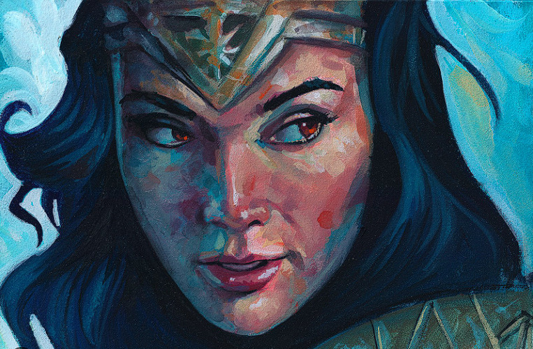

Hey Pandas, gather your paint tubes, your slightly suspicious water jar, and that one brush you keep promising to clean properly. Today we are talking about gouache artworks: the creamy, matte, wonderfully dramatic paintings that sit somewhere between watercolor’s delicate whisper and acrylic’s confident “I brought snacks and opinions” personality.
Gouache has been loved by illustrators, designers, painters, sketchbook artists, animation artists, and museum-worthy masters because it does something magical: it gives bold coverage while staying water-soluble and flexible. It can make a tiny postcard landscape feel cinematic, a character study feel velvety, and a floral painting look like it was lit from inside by a very polite sunbeam.
This article is an invitation. What gouache artwork makes you stop scrolling? Is it a moody landscape, a cheerful still life, a stylized animal portrait, a fantasy cottage, a vintage-style poster, or a tiny sketchbook page that somehow contains an entire emotional weather system? Share your favorite gouache artworks, and let’s celebrate why this medium keeps winning hearts, one opaque layer at a time.
What Is Gouache, Exactly?
Gouache is often described as opaque watercolor, but that definition only opens the door. Traditional gouache is a water-based paint that usually contains pigment, a binder such as gum arabic, and enough body to create a flat, matte, highly pigmented finish. Unlike transparent watercolor, which relies on the brightness of the paper shining through, gouache can cover previous layers, correct mistakes, and create graphic shapes with crisp edges.
That opacity is the reason artists reach for gouache when they want control. A gouache painting can be soft and atmospheric, but it can also be bold, poster-like, and clean. It is equally comfortable painting a foggy mountain, a peach on a kitchen table, a fashion illustration, a botanical study, or a character design with big main-character energy.
Why Gouache Artworks Feel So Addictive
1. The Matte Finish Looks Beautiful Online and in Person
One of the biggest reasons gouache artworks photograph so well is the matte surface. Glossy paint can reflect light like it is trying to signal passing aircraft. Gouache usually dries flat, which makes colors look soft, rich, and easy to scan. This is ideal for sketchbook tours, art prints, social media posts, and portfolio pages.
2. It Lets Artists Paint Light Over Dark
Watercolor is gorgeous, but it can be unforgiving. Once a dark area is down, adding a bright light on top can be tricky. Gouache is more forgiving. Artists can paint a dark forest first and then add pale tree trunks, moonlight, stars, window glow, or tiny flower highlights afterward. This makes gouache especially popular for night scenes, magical landscapes, and cozy illustrations.
3. It Has a Lovely Handmade Texture
Good gouache artwork often feels handmade in the best possible way. You can see brushstrokes, layering, dry-brush marks, and small decisions. Even polished pieces keep a hint of human touch. That is part of the charm. Gouache does not demand perfection; it rewards confidence, patience, and the willingness to paint over your first attempt while muttering, “This is fine.”
Famous and Inspiring Gouache Examples Worth Noticing
Museum collections show how versatile gouache can be. Paul Klee used watercolor and gouache in works that feel playful, mysterious, and structurally clever. Hélio Oiticica used gouache on paper in geometric compositions where color and shape become the main event. Tonita Peña’s gouache artworks demonstrate how the medium can carry cultural movement, rhythm, and storytelling with clarity and grace.
Carlo Bossoli’s large gouache landscape Balaklava shows another side of the medium: dramatic scale, architectural detail, and sweeping atmosphere. Winslow Homer used dense gouache in combination with watercolor to build texture and contrast. Charlotte Salomon created a vast narrative body of gouache paintings in Life? or Theater?, proving that gouache can be more than a pretty surface; it can become a whole visual language.
Even outside fine art, gouache has a long relationship with design. Jewelry houses have used gouache renderings to plan high jewelry pieces because the medium can describe gemstones, metal, reflection, and volume with beautiful precision. In other words, gouache is not just for dreamy mushrooms and cozy cottages, although we absolutely support dreamy mushrooms and cozy cottages.
Popular Types of Gouache Artworks Pandas Love to Share
Nature and Landscape Gouache Paintings
Gouache landscapes are everywhere for a reason. The medium makes it easy to block in mountains, skies, forests, lakes, and clouds with strong shapes. Artists can start with large color areas, then build smaller details: pine needles, sparkling water, distant rooftops, or a tiny moon that instantly makes the whole painting feel poetic.
Favorite examples often include desert sunsets, misty forests, seaside cliffs, rainy streets, snowy cabins, and peaceful garden corners. The best gouache landscapes do not always chase realism. Sometimes they simplify nature into strong silhouettes and color relationships, which gives them a storybook feeling.
Still Life and Everyday Objects
A mug, lemon, houseplant, matchbox, paint tube, or sandwich can become surprisingly dramatic in gouache. Still life gouache artworks are excellent because they teach observation without requiring a rare mountain view or a cooperative dragon. The artist can study light, shadow, composition, and color harmony using objects already sitting on the desk.
Food illustrations are especially charming in gouache. Strawberries, oranges, cakes, noodles, breakfast plates, and jars of jam all benefit from the medium’s rich color. Gouache can make a croissant look flaky, a tomato look sun-warmed, and a cup of coffee look emotionally supportive.
Character Art and Storybook Illustration
Because gouache creates clean shapes and vivid colors, it is perfect for character design. Artists use it for expressive faces, clothing folds, hair shapes, fantasy costumes, and whimsical animals. A small character painted in gouache can feel like it walked out of a children’s book, paused for applause, and then asked where the snacks are.
Storybook-style gouache often combines simple backgrounds, stylized proportions, and warm palettes. Think little foxes in scarves, witches in greenhouses, astronauts watering flowers, or cats who clearly own the apartment and merely tolerate humans.
Botanical Gouache Art
Leaves, flowers, mushrooms, herbs, and garden studies are natural matches for gouache. The paint can create flat decorative shapes or delicate layered details. Artists can use dark green bases, then add pale veins, petal edges, pollen dots, and soft color transitions.
Botanical gouache artworks are also highly shareable because they feel calm, decorative, and timeless. They work beautifully as greeting cards, wall prints, journal covers, and handmade gifts. A tiny gouache flower can say, “I care,” without requiring anyone to keep an actual plant alive. That is mercy.
What Makes a Gouache Artwork Memorable?
A Strong Color Palette
Color is the heartbeat of gouache. Because the paint dries matte and saturated, color choices become very visible. A memorable gouache artwork often uses a limited palette: warm orange and teal, dusty pink and olive, ultramarine and cream, or deep violet with glowing yellow highlights. Limiting colors can make the final piece feel more intentional and polished.
Confident Shapes
Gouache rewards strong design. Instead of blending everything into mush, successful artists often think in shapes: the shape of a shadow, the shape of a cloud, the shape of a cheek, the shape of a roof. This is why gouache is so popular with illustrators. It encourages artists to simplify the world without making it boring.
Layering Without Overworking
Layering is both the superpower and the trap of gouache. Since dried gouache can reactivate with water, too much brushing can disturb the layer underneath. The trick is to let layers dry, use enough paint, and avoid scrubbing like you are trying to remove ancient kitchen stains. A clean second layer can look velvety; an overworked one can look tired and patchy.
Little Details That Feel Earned
The final highlights are where many gouache artworks come alive. A dot in an eye, a thin edge of sunlight on a leaf, a white line on a glass jar, or a tiny bird in the sky can make the whole painting feel finished. The key is restraint. Details should support the artwork, not crowd it like tourists around a street performer.
Tips for Creating Gouache Artworks Worth Sharing
Start With a Simple Sketch
A light pencil sketch helps organize the composition before paint enters the chat. Keep it simple. Mark the major shapes, horizon line, focal point, and shadow areas. Gouache can cover pencil, but heavy graphite may muddy light colors, so sketch gently.
Use the Right Paper
Gouache works well on watercolor paper, mixed-media paper, illustration board, and sketchbooks made for wet media. Heavier paper handles water better and reduces warping. Smooth paper is great for clean illustration, while cold-press paper adds texture for landscapes and expressive work.
Control the Water
Too much water makes gouache behave more like watercolor. That can be useful for underpaintings and soft washes, but for opaque coverage, use a creamy consistency. Think melted ice cream, not soup. If the paint is streaky, it may need less water, more pigment, or a second layer after drying.
Work From Big Shapes to Small Details
Begin with background colors and large forms. Add middle shapes next, then smaller details at the end. This method prevents the painting from becoming busy too early. It also gives you permission to cover awkward first layers. Gouache is forgiving, but it still appreciates a plan.
Practice Color Swatches
Gouache can dry slightly different from how it looks wet. Some dark colors dry lighter, and some light colors dry darker. Making swatches helps avoid surprises. It is much better to discover a color shift on scrap paper than on the face of a portrait you have already emotionally adopted.
How to Share Your Favorite Gouache Artworks
If you are joining a “Hey Pandas” style community discussion, share more than just the image. Tell people why you love it. Is it the palette? The subject? The texture? The mood? The courage it gave you to try painting again? Personal context turns a pretty post into a conversation.
You can describe the artwork by noting the subject, color scheme, technique, and feeling. For example: “This gouache painting of a rainy bookstore is my favorite because the artist used deep blues and warm window light to make the whole scene feel cozy.” That tells readers what to look for and why it matters.
If you are sharing your own gouache artwork, include process details. Mention the paper, paint brand if relevant, brush size, time spent, and what you learned. Artists love behind-the-scenes notes because they make the finished piece feel approachable. Nobody wakes up painting perfect clouds. Most of us paint three suspicious potatoes first and then call the fourth one a cloud.
Beginner-Friendly Gouache Artwork Ideas
- A sunset postcard: Use three or four colors and focus on smooth sky shapes.
- A fruit study: Paint an apple, orange, or pear with simple highlights and shadows.
- A tiny house: Try a cottage, storefront, or cabin with bold shapes.
- A botanical page: Paint leaves, flowers, mushrooms, or herbs in rows.
- A pet portrait: Simplify the animal into large color blocks first.
- A night sky: Layer dark blue, purple, and black, then add stars with thick white gouache.
Common Gouache Mistakes and How to Fix Them
Using Paint That Is Too Watery
If your gouache looks streaky and pale, you may be using too much water. Add more paint and aim for a creamy mixture. For backgrounds, a thinner wash is fine, but final layers need more body.
Overworking the Surface
Because gouache can reactivate, brushing repeatedly over the same area may lift previous layers. Let the paint dry fully, then add the next layer with fewer strokes. Confidence is not just a mindset; it is also a brush technique.
Ignoring Values
Color gets attention, but value creates structure. Before painting, decide where the darkest darks and lightest lights will go. A gouache artwork with strong values will read clearly even if the palette is simple.
Adding Details Too Soon
Details are dessert. Do not eat dessert before building the meal. Paint the big shapes first, then add small marks when the composition is stable. This keeps the artwork clean and readable.
Personal Experience: Why Gouache Feels Like a Friendly Challenge
Painting with gouache feels a bit like learning to cook pancakes. The first one may be strange. The second one gives you hope. By the third, you start acting like you invented breakfast. The medium is approachable because it uses water, dries quickly, and allows corrections, but it also teaches discipline. You cannot bully it into behaving. You have to learn its timing.
One of the most satisfying gouache experiences is painting a small landscape in layers. First comes a pale sky wash, then a distant hill, then a darker tree line, then the foreground. At the beginning, the painting may look alarmingly flat. Then one small highlight on a rooftop or one dark shape under a tree suddenly gives it depth. That moment is addictive. It feels like the painting just woke up and said, “Fine, I’ll cooperate.”
Another memorable experience is discovering how much a limited palette can do. A beginner might think they need every color ever manufactured, plus three emergency greens. But gouache often shines with fewer colors. A painting made from blue, yellow ocher, burnt sienna, white, and a dark neutral can feel more unified than a rainbow explosion. The limitation forces better choices, and better choices make the artwork stronger.
Gouache is also fantastic for rebuilding confidence after creative burnout. Since it can cover mistakes, it removes some of the fear that comes with watercolor. If a shape looks wrong, let it dry and paint over it. If the background feels dull, add a bolder silhouette. If a flower becomes a blob, congratulations, it is now an abstract botanical moment. The medium invites experimentation without making every mistake feel permanent.
The best gouache artworks I have seen usually have one thing in common: they feel intentional but not lifeless. You can sense the artist making decisions. A sharp roof edge sits beside a soft cloud. A flat orange wall contrasts with a tiny blue shadow. A character’s coat is simplified, but the expression is full of personality. Gouache encourages this balance between design and emotion.
Sharing gouache artwork in a community setting makes the process even better. People notice things the artist may overlook: the cozy mood, the clever palette, the funny little cat in the corner, the way a shadow makes a cup look real. Feedback can turn a private sketchbook experiment into a shared celebration. And because gouache is so beginner-friendly, it creates a welcoming art conversation. Professionals, hobbyists, students, and “I bought paint during a midnight craft crisis” people can all join in.
So, Hey Pandas, share your favorite gouache artworks. Share the polished pieces, the sketchbook pages, the experiments, the tiny landscapes, the dramatic portraits, the cheerful fruit studies, and the paintings that made you fall in love with matte color. Gouache may be small enough to fit in a travel palette, but the worlds artists build with it are enormous.
Conclusion
Gouache artworks deserve their growing popularity because they combine beauty, flexibility, and personality. The medium can be bold or delicate, graphic or painterly, playful or profound. It has a place in museum collections, illustration portfolios, design studios, jewelry renderings, sketchbooks, and weekend art tables covered in snacks.
Whether your favorite gouache artwork is a famous museum piece or a tiny painting from someone’s sketchbook, the appeal is easy to understand. Gouache makes color feel intimate. It lets artists revise, layer, simplify, decorate, and tell stories. Most of all, it reminds us that art does not have to be enormous to be memorable. Sometimes all it needs is paper, pigment, water, and one brave little brushstroke.