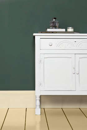

Green Smoke No. 47 paint is what happens when a deep green walks into a historic townhouse, borrows a velvet jacket, and somehow still looks completely relaxed. Officially known as Farrow & Ball Green Smoke No. 47, this smoky green-blue shade has become a favorite among homeowners, designers, cabinet painters, and anyone who has ever stared at a wall thinking, “White is fine, but what if my room had a personality?”
Unlike bright emerald or soft sage, Green Smoke sits in the sophisticated middle ground: dark enough to feel dramatic, muted enough to behave, and blue-toned enough to avoid looking too leafy or rustic. It is the kind of color that can make a powder room feel expensive, a kitchen feel grounded, a bedroom feel cocooned, and a front door look as though it knows a secret.
This guide explores what Green Smoke No. 47 really looks like, where it works best, how to pair it, which finishes make sense, and what to expect before you commit an entire weekendand possibly your favorite sweatpantsto painting with it.
What Is Green Smoke No. 47 Paint?
Green Smoke No. 47 is a dark, smoky green-blue paint color from Farrow & Ball. The brand describes it as a shade that was popular in late 19th-century interiors, which explains its old-world charm. It does not scream “trend.” It murmurs “library with excellent lighting.”
The color has depth, grayness, and a noticeable blue undertone. In some rooms, it reads like a rich weathered green. In others, especially cooler or north-facing spaces, it can lean more blue-green or teal. That shape-shifting quality is part of the appeal. It looks alive without being loud, which is a difficult trick unless you are a cat sitting on a freshly folded towel.
Why Green Smoke No. 47 Is So Popular
Green has become one of the most flexible colors in modern interiors because it connects a room to nature without requiring the owner to actually keep a houseplant alive. Green Smoke takes that natural feeling and adds polish. It is not grassy, neon, minty, or overly botanical. Instead, it feels calm, smoky, and architectural.
Designers often love colors that can act as both statement and neutral, and Green Smoke does exactly that. It can be the star of the room, but it also allows brass hardware, black accents, wood furniture, cream upholstery, framed art, marble, linen, and vintage rugs to shine. It has enough character to carry a space, but it does not fight every object in the room for attention.
What Undertones Does Green Smoke Have?
The main undertone in Green Smoke No. 47 is blue, softened by gray. That combination gives the paint its smoky quality. The blue undertone prevents it from becoming olive or khaki, while the gray keeps it from looking too jewel-toned.
In warm afternoon light, Green Smoke can appear richer and greener. In cooler daylight, it may look more muted and blue-based. Under warm artificial bulbs, it can become cozy and almost vintage. Under cool LED lighting, it may feel crisper and moodier. This is why sampling is not optional. It is the responsible adult in the room, even if the room is currently covered in painter’s tape.
How It Looks in Different Lighting
In a south-facing room, Green Smoke usually appears more balanced and warmer because the natural light brings out its green body. In a north-facing room, it can feel cooler, deeper, and slightly more blue. In east-facing rooms, it may look fresh in the morning and quieter later in the day. In west-facing spaces, it often becomes warmer and richer in the afternoon and evening.
For small spaces, the color can either feel cozy or dramatic depending on how it is used. A powder room painted entirely in Green Smoke can feel like a jewel box. A hallway with limited light may feel sophisticated if balanced with good lighting, pale trim, or warm flooring.
Best Rooms for Green Smoke No. 47
Green Smoke is versatile, but it especially shines in rooms where mood matters. It is less “blank canvas” and more “finished thought.” That makes it perfect for spaces that need atmosphere, depth, or a little design confidence.
Living Rooms
In a living room, Green Smoke creates a calm, grounded backdrop. It pairs beautifully with linen sofas, dark wood coffee tables, cream curtains, leather chairs, and antique brass lighting. If your living room currently feels like a waiting area with throw pillows, Green Smoke can give it instant intention.
Kitchens and Cabinets
Green kitchen cabinets remain popular because they feel classic and fresh at the same time. Green Smoke is especially good for cabinets because it is deep without being harsh. On lower cabinets, it grounds the room. On a full wall of cabinetry, it creates a custom, built-in look.
For kitchens, consider pairing Green Smoke cabinets with warm white walls, honed marble, soapstone, butcher block, unlacquered brass, bronze pulls, or creamy quartz. It also works with zellige tile and natural stone because the color has enough complexity to hold its own beside handmade textures.
Bedrooms
Green Smoke can make a bedroom feel restful and cocoon-like. It works especially well behind a bed, across all four walls, or as a color-drenched scheme including trim and doors. Add oatmeal linen bedding, walnut nightstands, soft white lampshades, and a wool rug, and suddenly the room feels like it should come with a hotel robe.
Bathrooms and Powder Rooms
Powder rooms are excellent places to use darker paint because they are small, self-contained, and allowed to have a little drama. Green Smoke on walls or vanity cabinets can look elegant with brass mirrors, black sconces, white sinks, and marble counters.
For bathrooms with moisture, choose the appropriate durable finish recommended for interior walls exposed to humidity. A beautiful color is wonderful, but a peeling wall is not “patina.” It is paperwork for your future self.
Home Offices and Libraries
Green Smoke is a natural fit for studies, offices, reading corners, and libraries. Its historical feel brings quiet focus without making the room feel sleepy. It pairs well with bookshelves, framed art, cognac leather, dark-stained desks, and shaded lamps.
Exterior Doors, Shutters, and Garden Structures
Outdoors, Green Smoke gains a weathered familiarity. It can look beautiful on front doors, shutters, fences, sheds, benches, and garden rooms. Against brick, stone, climbing vines, or creamy siding, it feels established rather than flashy.
Best Color Pairings for Green Smoke No. 47
Green Smoke is flexible, but it looks best when paired with colors that respect its muted depth. The safest approach is to combine it with warm whites, natural materials, and aged metals.
Whites and Neutrals
Warm whites are usually more flattering with Green Smoke than stark blue whites. Soft cream, shaded white, mushroom, stone, taupe, and warm gray can make the color feel elegant and calm. Very bright white trim can create a sharper contrast, which may work in modern spaces but can feel too crisp in older or softer interiors.
Wood Tones
Green Smoke loves wood. Oak makes it feel organic. Walnut makes it feel luxurious. Pine gives it a relaxed cottage look. Dark mahogany or espresso-stained wood can create a dramatic traditional effect. If your room already has wood floors or wood furniture, Green Smoke usually knows how to make friends.
Metal Finishes
Brass and bronze are classic partners for Green Smoke. They warm up the cool undertone and add a refined glow. Matte black works well for a more modern or industrial look. Polished nickel can also work, especially in bathrooms, but it creates a cooler effect.
Accent Colors
For a layered palette, try mustard, ochre, rust, terracotta, blush, dusty rose, navy, plum, ivory, charcoal, or chocolate brown. These colors bring out different sides of Green Smoke. Mustard makes it feel artistic. Terracotta makes it earthy. Navy makes it moody. Blush softens it. Plum says, “Yes, I own a velvet chair, and I regret nothing.”
Should You Use Green Smoke on Trim?
Yes, Green Smoke can look stunning on trim, doors, and millwork. Painting trim in the same color as the walls creates a seamless, color-drenched effect that feels modern and cozy. Using Green Smoke only on trim against pale walls creates a more tailored contrast.
For older homes with detailed moldings, Green Smoke can highlight architectural features beautifully. For newer homes without much architectural detail, it can create the illusion of depth and character. Paint cannot add crown molding, but it can definitely act like it has connections.
Which Finish Should You Choose?
The right finish depends on the surface and the amount of traffic. For low-traffic walls and ceilings, a very matte finish creates a soft, chalky depth. For busy spaces like hallways, kitchens, bathrooms, kids’ rooms, and mudrooms, a more durable washable finish is usually smarter.
For cabinets, doors, furniture, trim, and floors, choose a tougher eggshell or similar finish designed for wood, metal, or high-contact surfaces. For exterior doors and garden structures, use an exterior-rated finish that can handle weather exposure.
Matte finishes make Green Smoke look velvety and atmospheric. Higher-sheen finishes make it appear slightly richer and more reflective. On cabinets, a gentle sheen can make the color feel polished without turning your kitchen into a mirror maze.
Green Smoke No. 47 vs. Similar Green Paint Colors
Compared with sage greens, Green Smoke is darker, moodier, and more blue-toned. Compared with olive greens, it is cooler and less yellow. Compared with forest greens, it is softer and smokier. Compared with teal, it is earthier and more traditional.
If you want a pale, airy green, Green Smoke may be too deep. If you want a dramatic black-green, it may not be dark enough. But if you want a sophisticated middle-dark green that feels timeless, lived-in, and slightly mysterious, Green Smoke is an excellent candidate.
How to Test Green Smoke Before Painting
Never judge Green Smoke from a tiny digital square. Screens lie. They lie confidently. Paint a large sample on card or use a peel-and-stick sample, then move it around the room. Check it in morning light, afternoon light, evening light, and artificial light.
Place the sample beside flooring, countertops, tile, upholstery, and trim. A color that looks perfect on one wall may look entirely different next to orange-toned wood or cool gray tile. Sampling protects you from expensive surprises and from saying, “Interesting,” in the tone people use when they hate something but are trying to remain polite.
Practical Painting Tips for Green Smoke
Because Green Smoke is a deeper color, surface preparation matters. Patch holes, sand rough areas, clean grease or dust, and use the recommended primer or undercoat for dark tones. A proper primer helps the color develop evenly and can reduce the number of coats needed.
Use high-quality brushes and rollers. Keep a wet edge while painting to avoid lap marks. Allow proper drying and recoat times. Dark, matte paints can sometimes show uneven application more than pale colors, so patience matters. This is not the time to paint one wall, answer six texts, make a sandwich, then return like nothing happened.
Common Mistakes to Avoid
The first mistake is using Green Smoke in a room without considering lighting. The second is pairing it with the wrong white. The third is choosing a finish that is too delicate for a hardworking surface. The fourth is skipping samples because one beautiful photo online looked perfect.
Another common mistake is under-lighting the room. Deep colors often need layered lighting: ceiling fixtures, sconces, lamps, under-cabinet lights, or picture lights. Good lighting brings out the richness of Green Smoke. Poor lighting can make it look flat or heavier than intended.
Is Green Smoke No. 47 Worth It?
Green Smoke No. 47 is worth considering if you want a paint color that feels rich, calm, and design-forward without being trendy in a disposable way. It works in traditional homes, modern cottages, city apartments, historic houses, and transitional interiors.
It is not the cheapest-looking color, and that is the point. Green Smoke adds visual weight and atmosphere. Even when used on a single vanity, door, or set of cabinets, it can make a space feel more considered. It has that rare quality of being bold but not bossy.
Real-Life Experience: Living With Green Smoke No. 47 Paint
Using Green Smoke No. 47 in a home feels different from simply admiring it online. On a screen, it may look like a handsome green. On the wall, it becomes part of the room’s rhythm. In the morning, it can feel calm and slightly cool. By late afternoon, especially with warm sunlight, it can become richer and more inviting. At night, under warm lamps, it settles into a cozy, almost cinematic mood.
One of the best experiences with Green Smoke is seeing how well it handles natural textures. Place it beside a woven basket, a linen curtain, a wood table, or an old brass lamp, and it instantly looks comfortable. It does not demand perfection. In fact, it often looks better with things that have age, grain, texture, and a few life stories. A brand-new glossy room can sometimes feel stiff, but Green Smoke loosens its tie a little.
On cabinets, the experience is especially satisfying. Green Smoke gives ordinary cabinetry a custom look, particularly when paired with classic hardware. A simple shaker cabinet painted in this color can feel more expensive than it is. Add brass knobs, a creamy backsplash, and a warm wood shelf, and the whole room starts behaving like it has a designer hiding behind the refrigerator.
In bedrooms, Green Smoke has a quiet confidence. It does not feel sugary or overly decorative. Instead, it creates a restful backdrop that works well with white bedding, beige linen, rust pillows, or dark wood furniture. It can make a bedroom feel finished even without many accessories. That is helpful for anyone whose decorating style is currently “laundry chair with ambition.”
The main lesson from living with this paint is that lighting is everything. In a dim hallway, Green Smoke may need wall sconces or a pale runner to keep it from feeling too heavy. In a bright kitchen, it can look balanced and elegant. In a powder room, it can go dramatic in the best way, especially with a mirror, good lighting, and a little metallic warmth.
Another real-world note: do not rush the prep. Darker colors show careless edges and uneven patches more than forgiving pale neutrals. Tape cleanly, prime properly, and apply smooth coats. If painting cabinets, take doors off, label hardware, sand carefully, and give the finish time to cure. Cabinet painting is not difficult, but it does require the emotional maturity to let paint dry. This is harder than it sounds.
Green Smoke also teaches restraint. Because the color already has depth, you do not need to overload the room with competing drama. Let the paint do some of the work. A few excellent materialswood, stone, linen, brass, black accents, ceramic lampsare usually enough. When in doubt, remove one accessory and add better lighting.
The final experience is the compliments. People notice Green Smoke. They may not always know the name, but they tend to ask about it. It has a memorable quality without feeling strange. It is a color for people who want their homes to feel personal, warm, and slightly elevatedbut who still want the room to be livable, not a museum where guests are afraid to sit down.
Conclusion
Green Smoke No. 47 paint is a sophisticated smoky green-blue that brings depth, calm, and character to interior and exterior spaces. It works beautifully on walls, cabinets, trim, doors, furniture, and garden features. Its blue-gray undertones make it more complex than a typical green, while its historic feel gives it staying power.
The key to success is sampling it in your own light, pairing it with warm whites and natural materials, choosing the right finish for the surface, and giving the room enough lighting to let the color breathe. Used well, Green Smoke can turn a plain room into a polished, memorable spacewithout making your home feel like it is trying too hard.
Note: This article is original editorial content based on verified product information, current interior design guidance, and practical painting best practices. Source links are intentionally not included in the article body per publishing requirements.


